User Researcher
Mapping the ATM landscape (part 1)

Designing for ATM within legacy, physical
and technical constraints
ATMs can be difficult to update due to the physical constraints of the device, legacy backend systems and roll-out. With 16 million transactions a month, Nedbank wants to give their product a brand refresh while bringing new innovative tech to stay relevant in the market.
My role
Product Designer
Year
2020
Project Objective
With the frontend interface being hardcoded, manually updating every device takes time and is costly. Moving the interface to a backend web server will help make updates/deploy remotely and quickly like you can with web. Nedbank also wants to align the outdated UI to the design system and improve flows with usability enhancements.
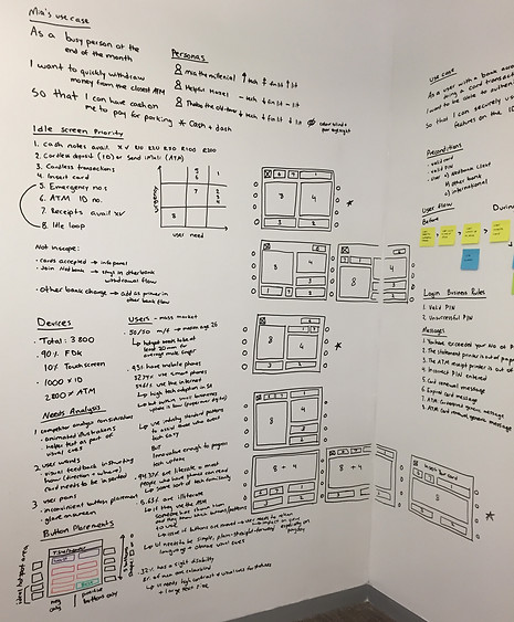
Mapping out the current landscape
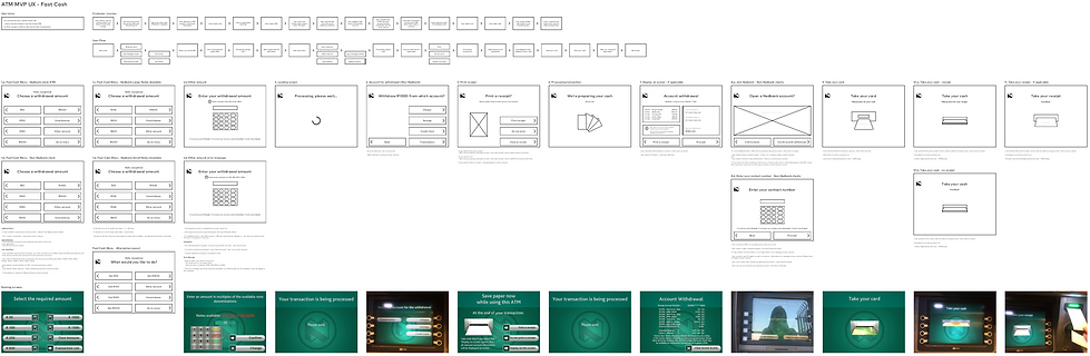
Due to the ATMs being a legacy system, there was little to no documentation on the existing state. User Journey flows were craft by using the device, taking screenshots and plotting out the current flow.
After that was constructed, a site map and proposed state was created. The IA was adjusted so that the most-used features were brought-up a level to cater for easier discovery.


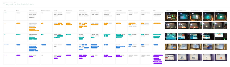
Competitor Analysis
A comparison was done on how our ‘fast cash withdrawal’ flow was different to other banks. This matrix was used to identify what the differences and similarities are.
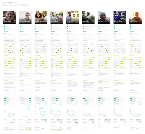
User Personas
Hypothetical user personas were then created based on existing customer segments. A card sort was done to focus on their financial literacy, financial management, technology adoption and technology engagement. This was used to help inform how they would interact with an ATM and why. After the card sorting, it became apparent that there wasn’t a key user – rather this is a task-oriented product used by archetypes.
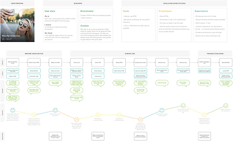
Customer Journeys
Using the hypothetical personas, customer journeys were crafted. These highlighted that there are issues with the devices being slow, loud and confusing with the way information was presented to them.
Whiteboarding
Whiteboarding was done to gather all the information together and see how it could inform the idle screen. To prioritise the hierarchy, an urgency x user need diagram was used to help create a few concepts.
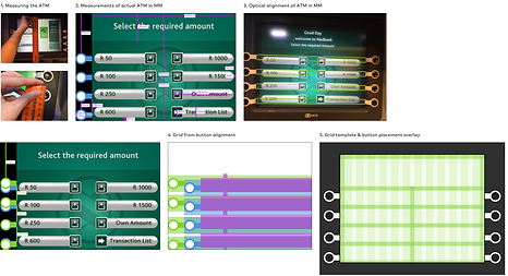
Button placement grid
A grid was needed in order to start wireframing. Button placements of the physical buttons were measured. These dimensions were mapped out against an existing screenshot. These dimensions however, did not optically fit to the UI as the screen is inset and depending on your height, you'd view it differently. An optically adjusted grid was made to cater for this.
Wireframing early on
A wireframing tool kit was created based on the new grid. For MVP, the UX artboards consisted of the user story, ‘as-is’ vs ‘proposed’ task flows, acceptance criteria, and wireframes vs existing screens. This helped identify possible alternative/negative flows and question usability flaws in the existing system.
Task flows that incorporated user interactions and system responses were added, as well as preconditions and assumptions next to the user story. This was used to help write use cases for the features.
Wireframing at maturity